For generations, most of us have grown up looking at the world through the same map: the Mercator projection. Now, the United Nations is encouraging the world to look at it differently.
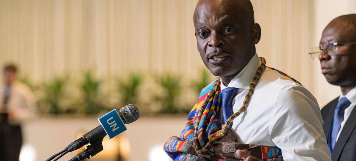
On September 4, the UN General Assembly voted 164–1 to support a resolution promoting maps that more accurately represent the relative size of the world’s landmasses. The initiative was led by Togo and backed by the African Union, with the United States the only country to vote against and six countries abstaining.
Image Credit: UN Photo
At the centre of the campaign is the Equal Earth projection, a 2018 map designed to preserve the relative area of continents more accurately than Mercator.
The difference is striking. On the familiar Mercator map, Greenland can appear roughly comparable in size to Africa. In reality, Africa is about 14 times larger. Africa covers approximately 30.4 million square kilometres, compared with Greenland’s roughly 2.2 million.
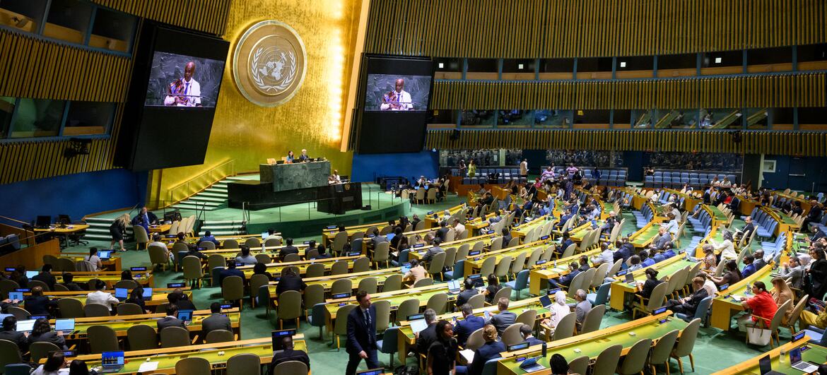
Image Credit: UN Photo
But the Mercator map wasn’t created to diminish Africa. Developed by Flemish cartographer Gerardus Mercator in 1569, it was designed primarily for maritime navigation. The trade-off is that areas become increasingly distorted as they move away from the equator, making countries and regions in the northern hemisphere appear much larger than they actually are.
For African campaigners, however, the issue goes beyond cartography.
Togo’s Foreign Minister Robert Dussey has argued that maps influence how people understand the world, from classrooms to popular culture. The Correct the Map campaign frames the change as part of a broader effort to challenge inherited perceptions of Africa and give the continent a more accurate place in global representation.